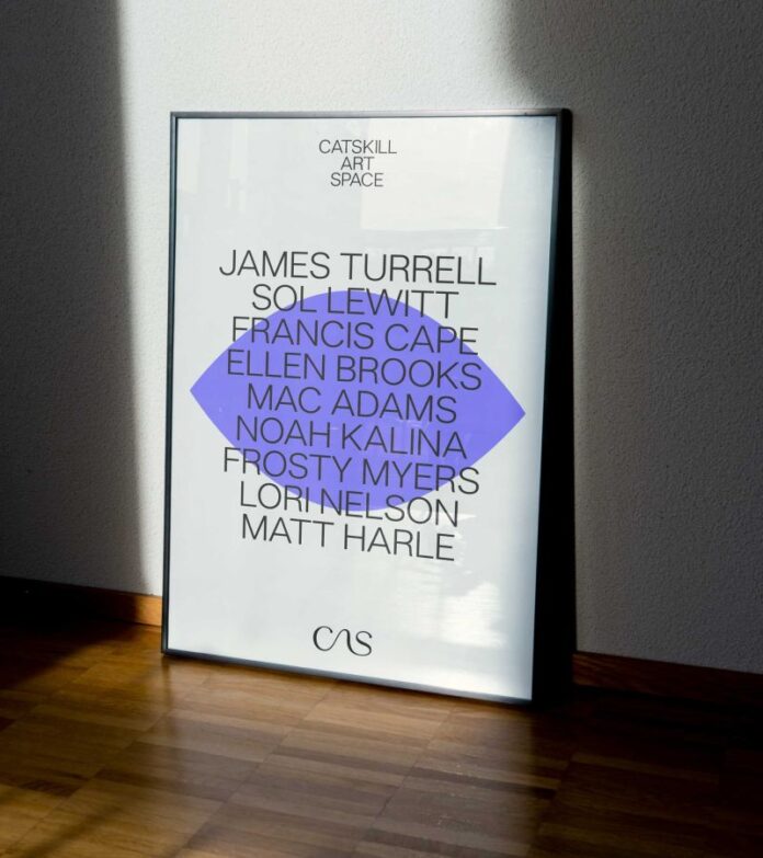
The nonprofit arts organisation recently celebrated its 50th anniversary during an important moment in its growth. Ana Realmuto, senior designer at Athletics and the creative lead behind the identity, explained: “Over the last two years, many New Yorkers have been flocking to the bubbling creeks and rustling leaves of upstate New York, bringing their love for big city art with them. And with deep roots in the region since 1971, the Catskill Art Space has transformed into a cultural destination for world-class art with a local charm, featuring the likes of James Turrell, Sol LeWitt, and more.”
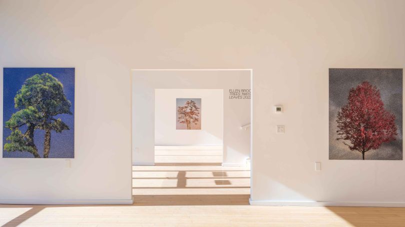
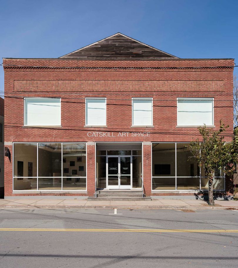
In 2022, the space underwent significant renovations and needed its brand presence to better reflect its elevated role within the community and global art scene. The team at Athletics were brought on to develop a new brand identity that reflected CAS’s future ambitions while remaining true to its local heart and soul.
Credit: Athletics / Catskills Art Space
Credit: Athletics / Catskills Art Space

Credit: Athletics / Catskills Art Space
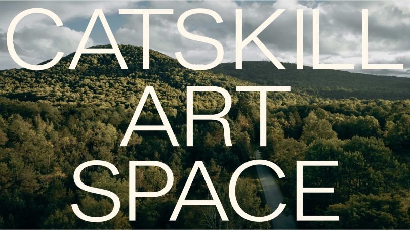
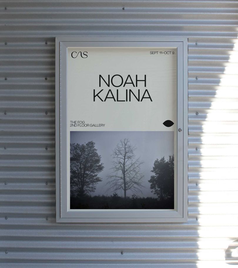
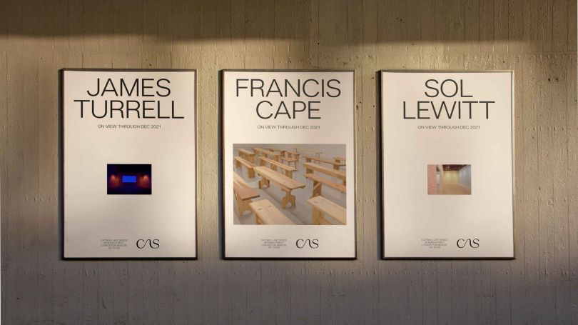
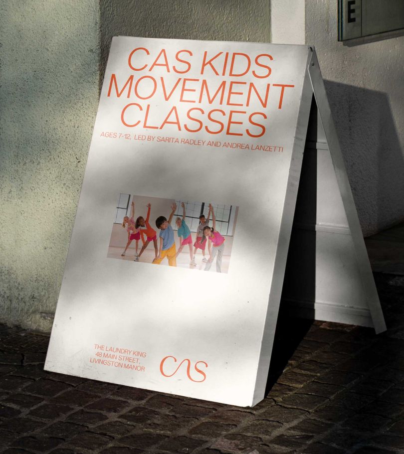
Athletics has created a modern new design system that puts both the Catskills Arts Center’s impressive collection and unique local charm front and centre. Inspired by the recent renovations to the space, which seamlessly united the old with the new, Athletics was inspired to create a brand design that functioned similarly – connecting the organisation’s community roots with its global ambitions for the future.
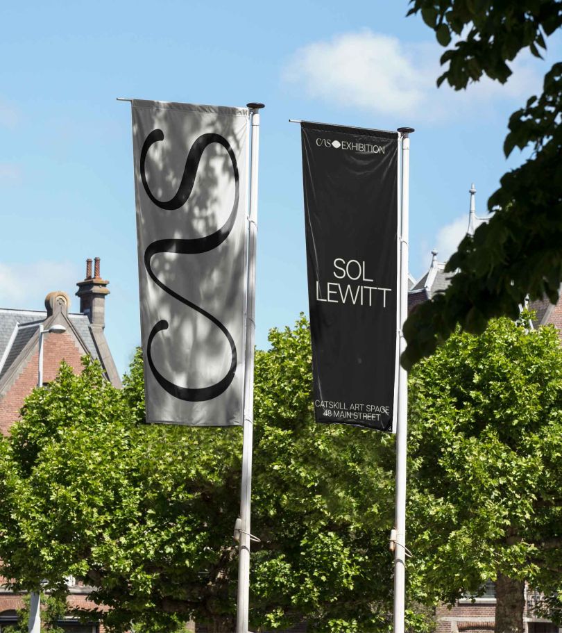
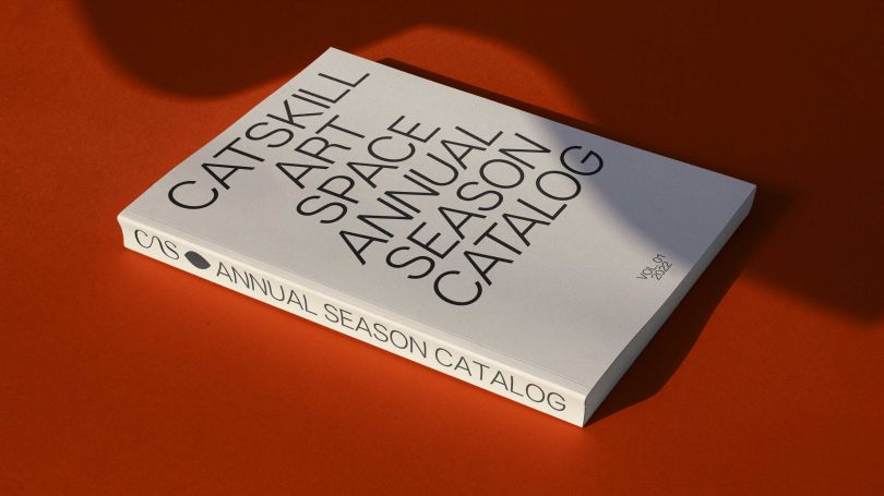
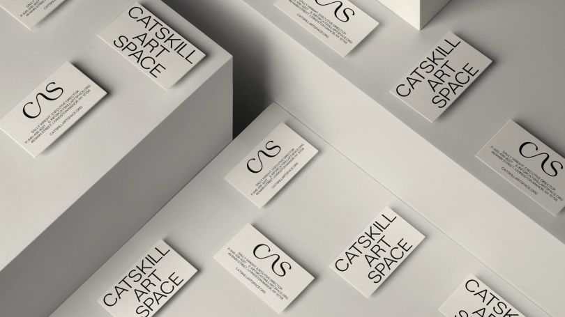
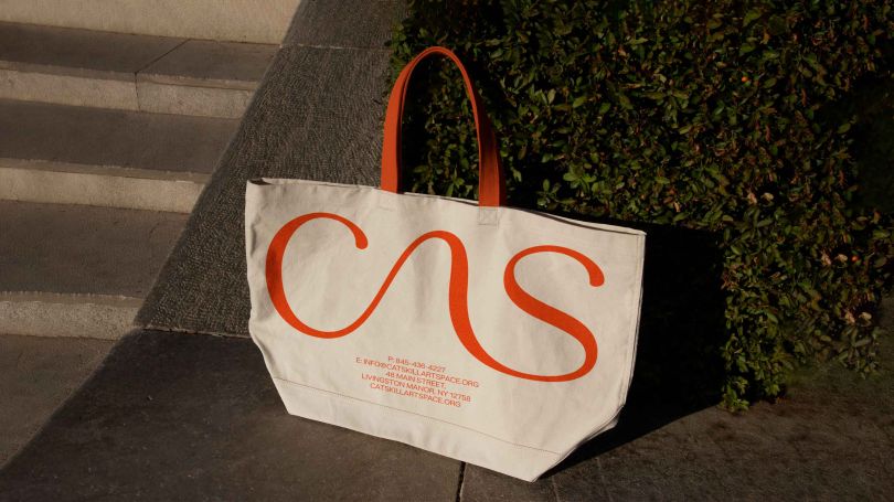
The hero element that really elevates the entire identity is a fluid new monogrammed logo. Athletics’ Ana Realmuto told Creative Boom that the wordmark is “the piece the rest of the system plays off. It anchors the design in something authentic to CAS’s origins and is a soft partner to its more straightforward counterparts. We love its flexibility – an unabashed presence when we want to scale up and take centre stage versus a more quiet cosign of featured artists and exhibitions. Regardless of its application, the monogram brings a natural human touch to a prestigious organisation, reminding us that we can ultimately have both personality and elegance.
Credit: Athletics / Catskills Art Space
Credit: Athletics / Catskills Art Space
Credit: Athletics / Catskills Art Space
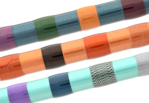
The mark for Catskill Art Space “CAS” was developed in a gestural style to evoke the many expressions of the community – the river that goes through the town, the curves of local creatures, and an ode to the fly fishing line. This purposeful ambiguity always comes back to Livingston Manor. By balancing the human with clarity and contemporary precision, the sinuous mark is easily readable for events and environmental graphics and in the form of a monogram for smaller, personalised moments.
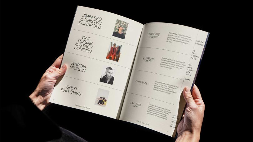
A new typeface, Lars Extended Light, was selected for its versatility and ease of use. With universal appeal and contemporary sophistication, Lars gives the Catskill Art Space team a typographic voice that will complement and reinforce their wide variety of creative exhibitions and performances.
Meanwhile, CAS’s new naturalistic palette reflects the local environment. The neutral suite of core colours allows for the vitality of CAS’s art and programming to take the foreground. A secondary accent palette of red, purple and green provides brand recall and visual impact for key communications.
Realmuto said: “The colour palette lives between two worlds – a serious neutral set designed to quietly support the art and vibrant pops to amplify our sense of place.”
Credit: Athletics / Catskills Art Space

Credit: Athletics / Catskills Art Space
Credit: Athletics / Catskills Art Space
Community – both as it pertains to the local Catskills area and the global art scene – has been a crucial consideration for both the CAS team and Athletics every step of the way, and the resulting brand manages to speak successfully to both, positioning CAS as an accessible, local gem and a well-curated global contender.
Reflecting on CAS’s new brand and next steps, Sally Wright, executive director at the Catskill Art Society summed up CAS’s ambitions: “We’re trying to open the doors in a way so more people will come in. It’s challenging, breaking down the perceptions of what an art gallery or art centre is.”
Athletics’ Realmuto’s personal experience working on the project speaks to the power of Wright and CAS’s mission. Realmuto told Creative Boom: “Although I visit the Catskills often, I’ve never been able to experience the community quite like that before – seeing so much love and support for the rebrand and the space at large during the reopening was a memorable experience for me. As a designer, you’re always striving for the work to resonate with the community you’re serving; witnessing that firsthand was special.”
Credit: Athletics / Catskills Art Space
Credit: Athletics / Catskills Art Space
Credit: Athletics / Catskills Art Space
Credit: Athletics / Catskills Art Space
Credit: Athletics / Catskills Art Space
Credit: Source link


